
Everything I include in Phase 1 of a Website (The Planning Phase)
Good websites don't start with design. They start with a plan.
Every client I work with hears me say some version of this, usually before we've even talked about colors or layouts. It's tempting to want to jump straight into "what will it look like," but if you skip the planning phase, you end up with a pretty site that doesn't actually work for your business. So before I open a single design file, here's what I build out first.
1. Brand Voice, Customer & Keywords
Before anything visual happens, I need to know who I'm talking to and what I'm saying to them.
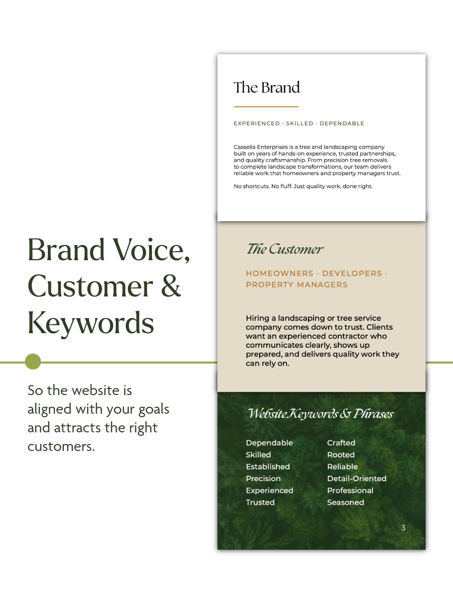
For Cassella Enterprises, a tree and landscaping company, that meant defining the brand around three words: experienced, skilled, dependable. Their customers are homeowners, developers, and property managers, people who are hiring based on trust. They want a contractor who communicates clearly, shows up prepared, and delivers work they can rely on.
From there, I pull together the keywords and phrases that should show up across the site. Words like dependable, established, precision, trusted, rooted, reliable. This keeps the messaging consistent and makes sure the site is actually attracting the right kind of customer, not just sounding nice.
2. Brand Colors & Fonts
Next comes the palette and type pairing (the visual language that carries the brand voice through the design).
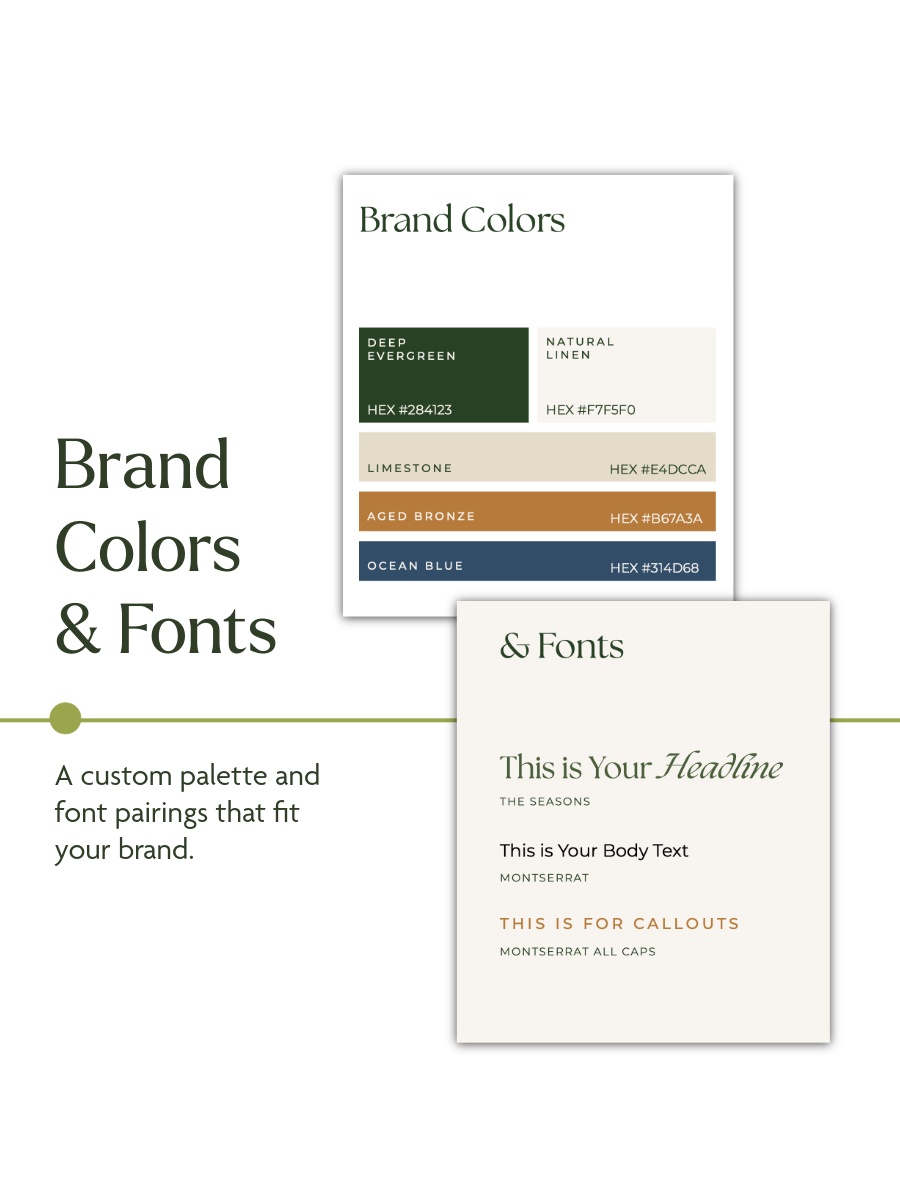
For Cassella, that landed on a grounded, natural palette: deep evergreen, natural linen, limestone, aged bronze, and ocean blue. Paired with a serif for headlines, a clean sans for body copy, and all-caps for callouts, it reads as established and trustworthy without feeling stiff.
This step matters more than people think. Colors and fonts aren't decoration, they're doing the same job as the words on the page.
3. The Vision Board
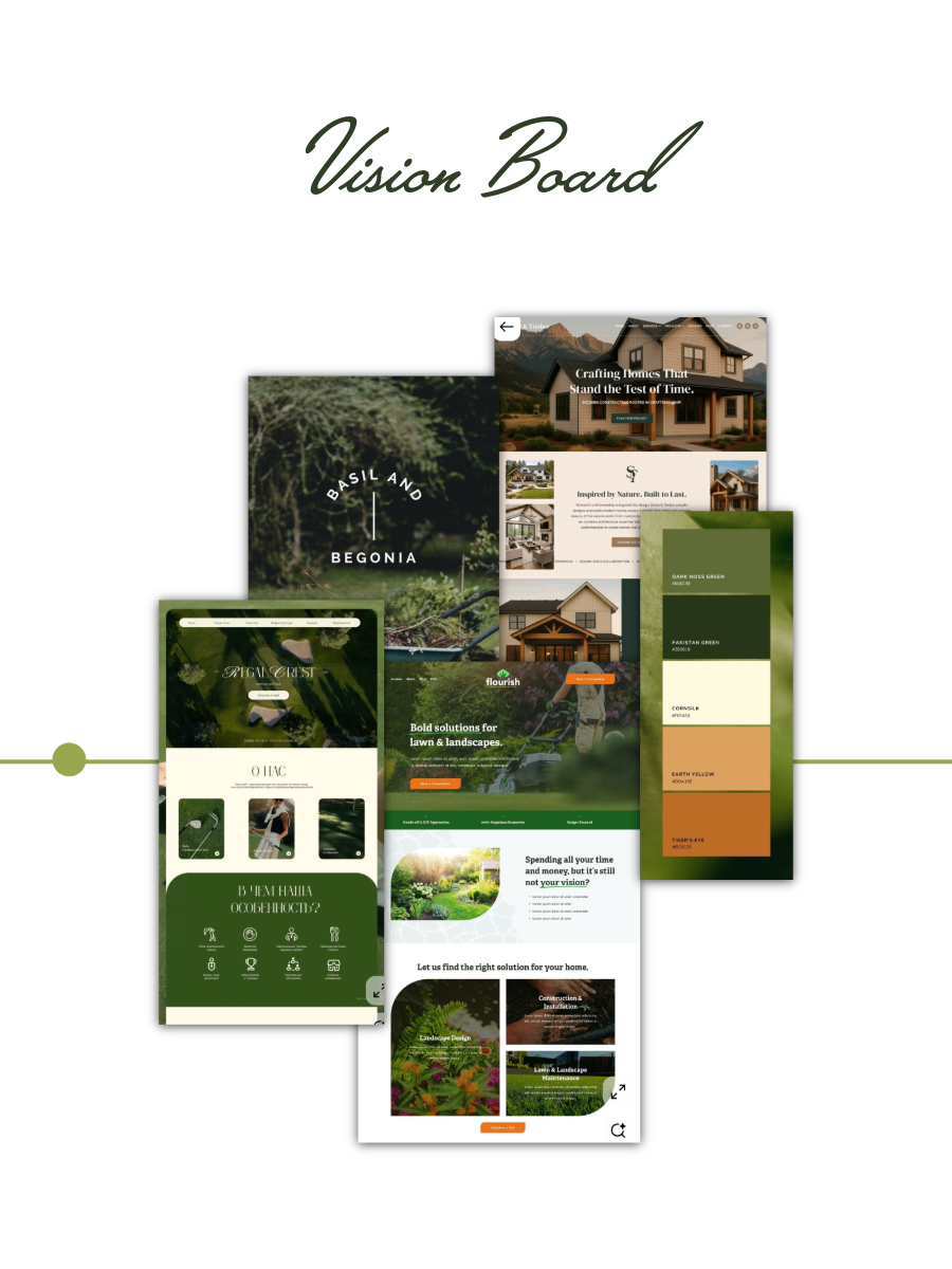
Once the strategy and the palette are set, I pull inspiration that show how this direction could actually come to life. It's not about copying anything; it's about testing whether the direction feels right before I commit real design time to it.
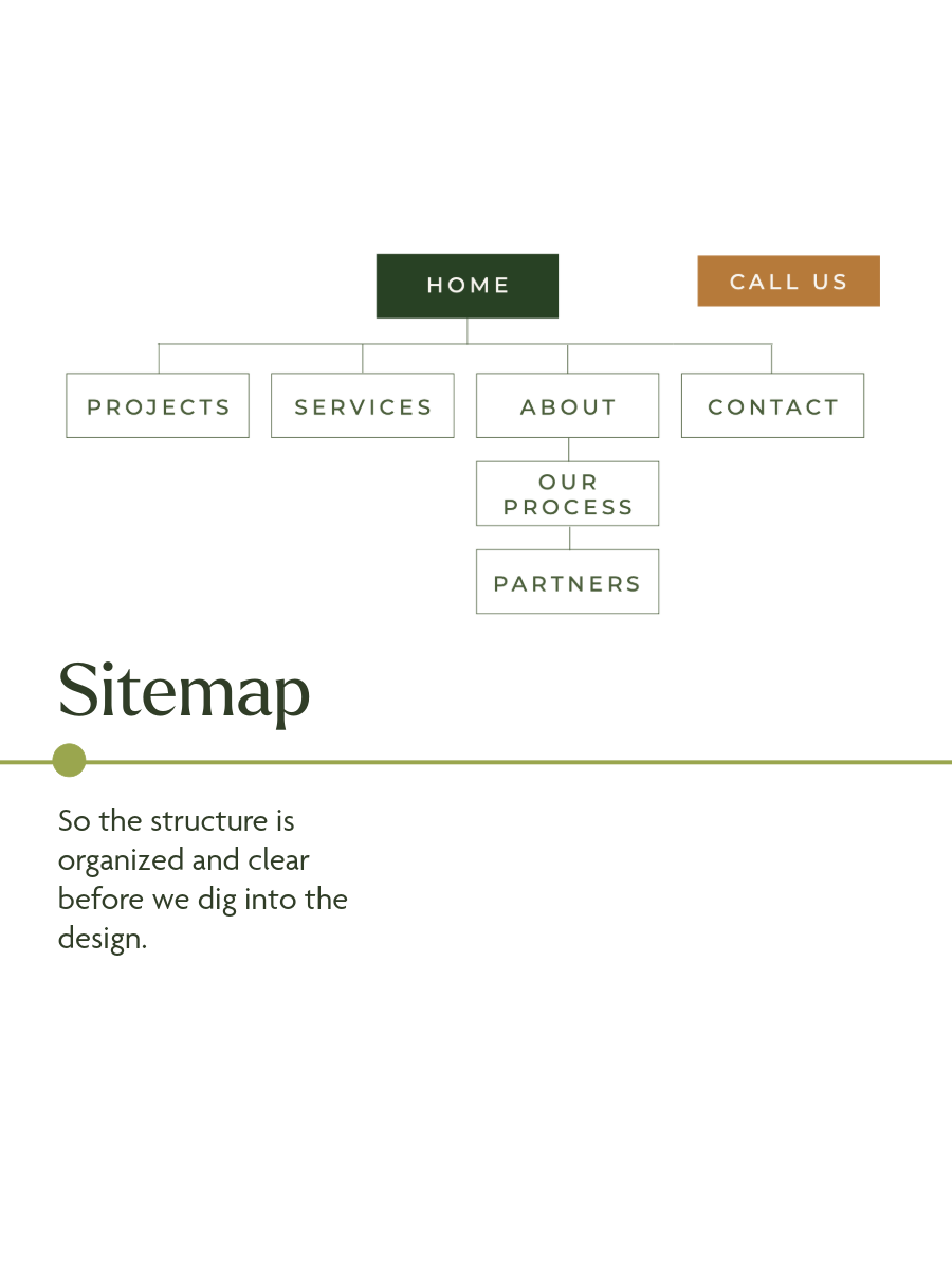
4. Sitemap
Before I touch a single mock-up, I map out the structure. This is the skeleton the whole site hangs on. Getting it organized and clear now means the design phase moves faster and nothing gets lost or bolted on later.
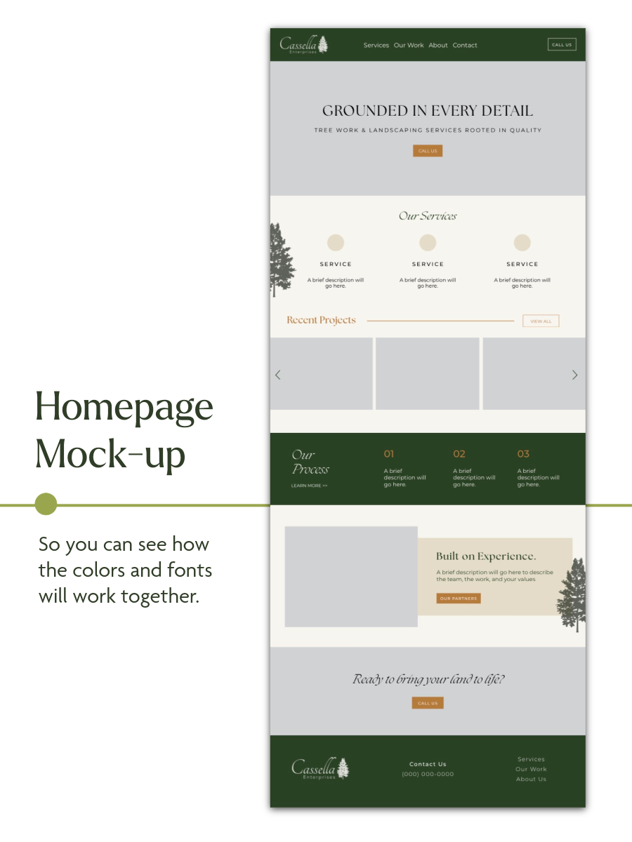
5. Homepage Mock-up
Finally, I bring it together: a homepage mock-up that shows how the colors, fonts, and structure actually work as a real page. It's still low-fidelity at this stage (grey boxes instead of final photography, placeholder copy instead of final content), but it's enough to see the shape of the site and confirm the direction before full design begins.
Why plan first?
Because a website isn't just a pretty face, it's a tool that needs to attract the right customer, sound like your brand, and be built on a structure that makes sense. Phase 1 is where all of that gets figured out, so Phase 2 (the actual design) is fast, focused, and right the first time.
Good websites don't start with design. They start with a plan.
It's time to start yours.